Mobility design: Unlocking bike sharing
Donkey Republic is a bike-sharing company offering a convenient and eco-friendly way to navigate cities around the world. In my role as the designer of the Donkey Republic mobile app, I focused on creating a user-friendly experience for Donkey Republic's global users.
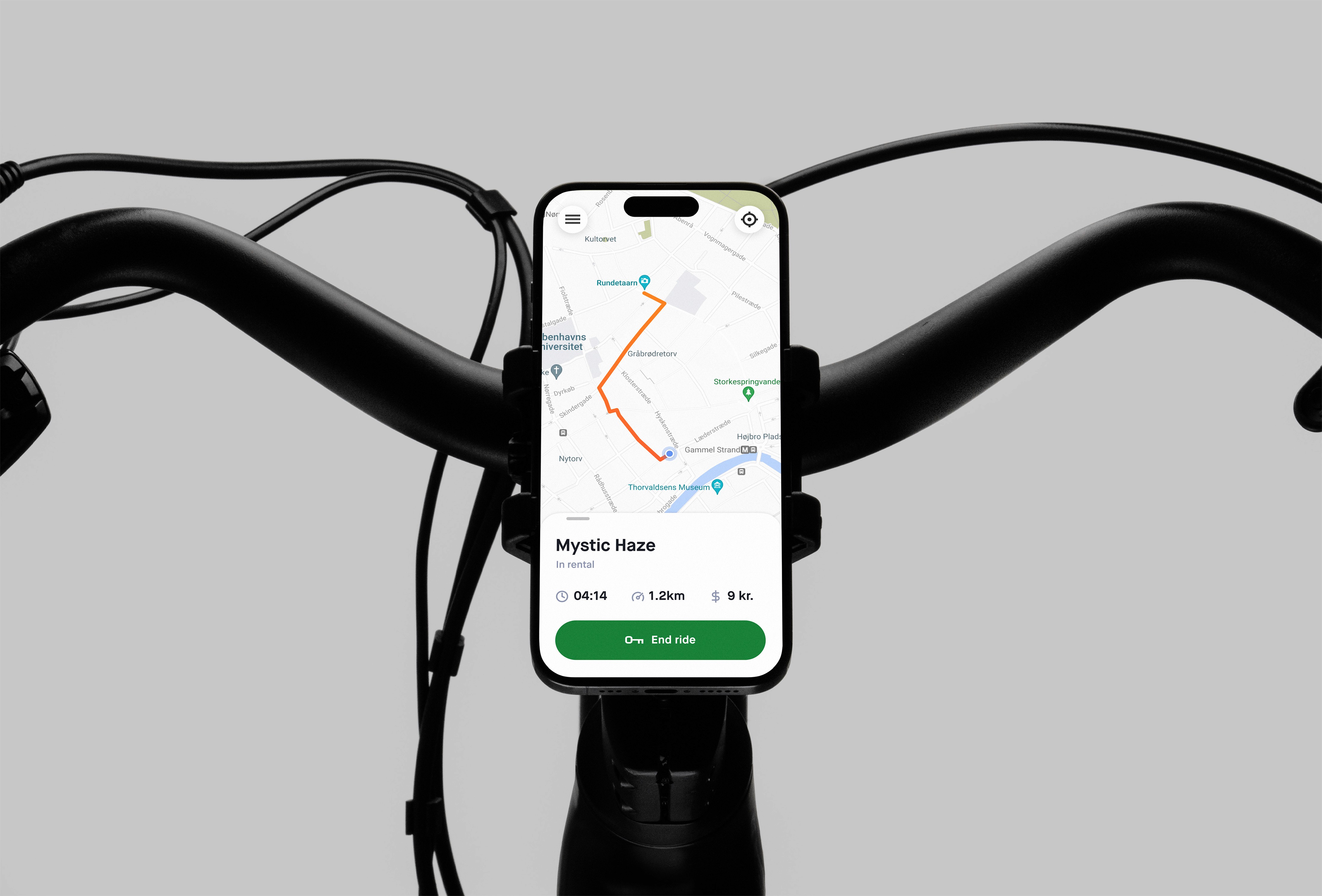

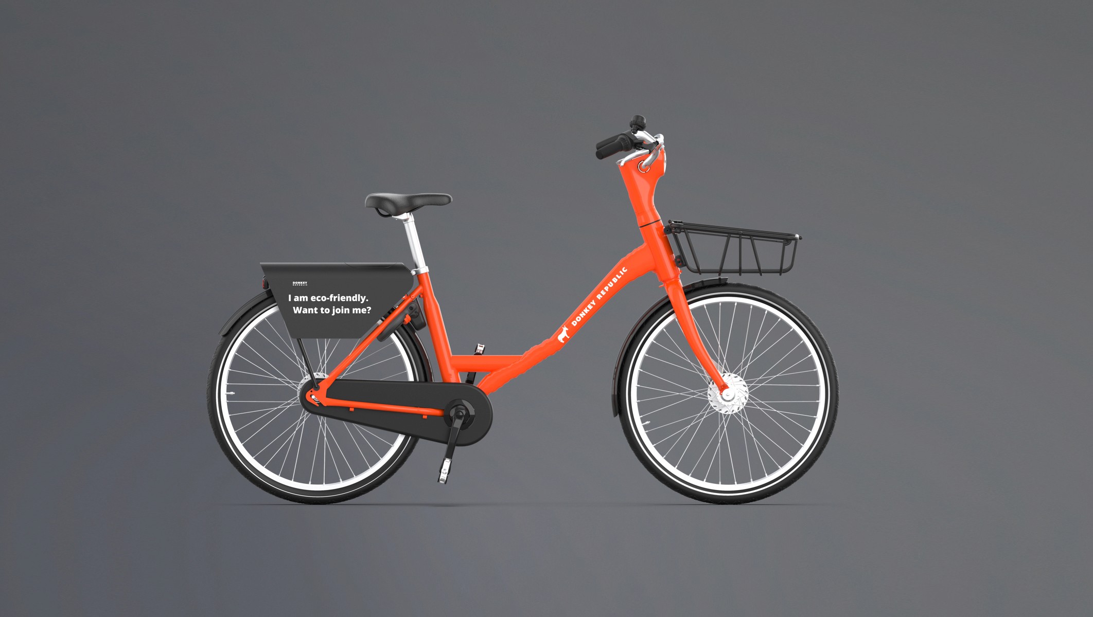
↳ Donkey bikes have special locks that use Bluetooth to talk to the Donkey Republic app on your phone.

↳ Donkey bikes have special locks that use Bluetooth to talk to the Donkey Republic app on your phone.
UX needs
Creating a seamless user experience that caters to two critical needs: ¹ Enable users to effortlessly discover available bikes near their location, minimizing search time and maximizing their ride time. ² Ensuring a frictionless rental flow. From finding a bike to unlocking it and starting the ride, the entire process should be smooth and intuitive, free of unnecessary steps or complexities that could disrupt the user's experience.
01
Commuter
Goals: Efficiently travel short distances for work or leisure, avoid traffic congestion, and reduce carbon footprint.
Needs: Easy-to-find bikes, reliable app functionality, clear instructions, and secure bike locking.
Frustrations: Difficulty finding available bikes, bikes with low battery, and inconvenient drop-off locations.
02
Tourist
Goals: Explore the city in a convenient and affordable way, experience local culture, and stay active.
Needs: Clear map interface, easy-to-follow instructions, and secure bike locking.
Frustrations: Language barriers, difficulty understanding the app, and issues with bike availability.
03
Eco-Citizen
Goals: Reduce carbon footprint, promote public transportation, and support eco-friendly businesses.
Needs: Reliable bike availability, well-maintained bikes, and clear communication about the company's environmental impact.
Frustrations: Bikes left in inappropriate locations, vandalism of bikes.
↳ Understanding the audience
The app should make finding bikes easy by utilizing a map view that allows users to locate available bikes through zooming and panning. It should also offer a reservation system to hold bikes for a limited time, ensuring some level of ride predictability while maintaining bike availability. Additionally, the app should streamline the unlocking process with a user-friendly in-app button, eliminating the need for external tools or codes.
The app should make finding bikes easy by utilizing a map view that allows users to locate available bikes through zooming and panning. It should also offer a reservation system to hold bikes for a limited time, ensuring some level of ride predictability while maintaining bike availability. Additionally, the app should streamline the unlocking process with a user-friendly in-app button, eliminating the need for external tools or codes.
The app should make finding bikes easy by utilizing a map view that allows users to locate available bikes through zooming and panning. It should also offer a reservation system to hold bikes for a limited time, ensuring some level of ride predictability while maintaining bike availability. Additionally, the app should streamline the unlocking process with a user-friendly in-app button, eliminating the need for external tools or codes.
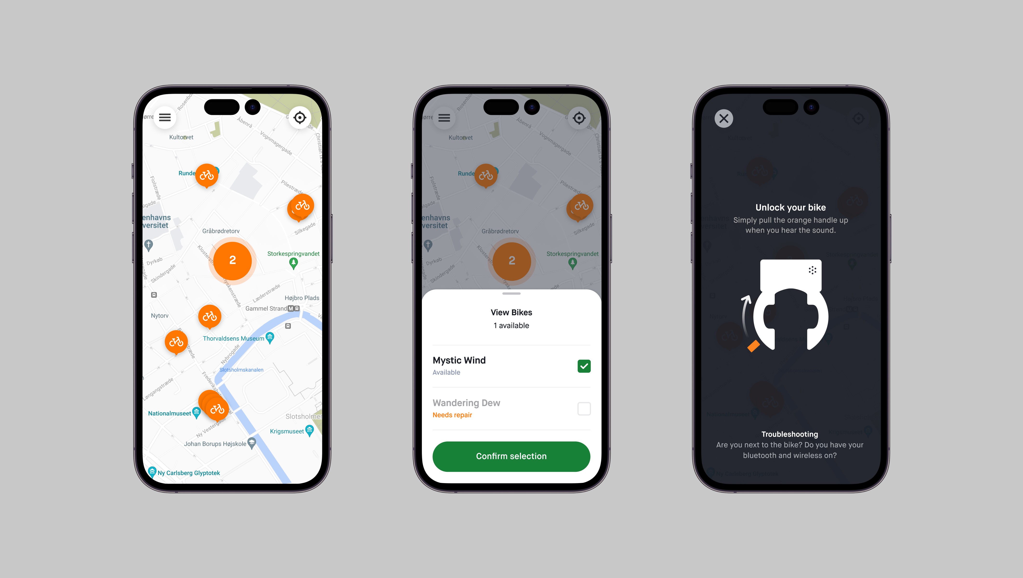
↳ Finding, Reserving and Unlocking. See nearby bikes on a map (left), select and confirm your reservation (center) and unlock (right).

↳ Finding, Reserving and Unlocking. See nearby bikes on a map (left), select and confirm your reservation (center) and unlock (right).

↳ Finding, Reserving and Unlocking. See nearby bikes on a map (left), select and confirm your reservation (center) and unlock (right).
UX findings
After launching the app successfully, we encountered some concerning user feedback. While the initial app allowed users to locate available bikes on a map and reserve them, upon arriving at the designated location, users frequently couldn't find the specific bike they had reserved.
UX findings
After launching the app successfully, we encountered some concerning user feedback. While the initial app allowed users to locate available bikes on a map and reserve them, upon arriving at the designated location, users frequently couldn't find the specific bike they had reserved.
UX findings
After launching the app successfully, we encountered some concerning user feedback. While the initial app allowed users to locate available bikes on a map and reserve them, upon arriving at the designated location, users frequently couldn't find the specific bike they had reserved.
“We wanted to use Donkey Republic to see the city, but the app was confusing and we couldn't find one of the reserved bikes at the pick-up location.”
↳ Julia, The Netherlands
Initially, the app adopted a "free-floating" system where users could leave bikes at any location after their ride. However, this approach presented challenges such as missing bikes, inaccessible bikes left in private areas, and difficulty locating bikes with dead batteries.
Initially, the app adopted a "free-floating" system where users could leave bikes at any location after their ride. However, this approach presented challenges such as missing bikes, inaccessible bikes left in private areas, and difficulty locating bikes with dead batteries.
Initially, the app adopted a "free-floating" system where users could leave bikes at any location after their ride. However, this approach presented challenges such as missing bikes, inaccessible bikes left in private areas, and difficulty locating bikes with dead batteries.
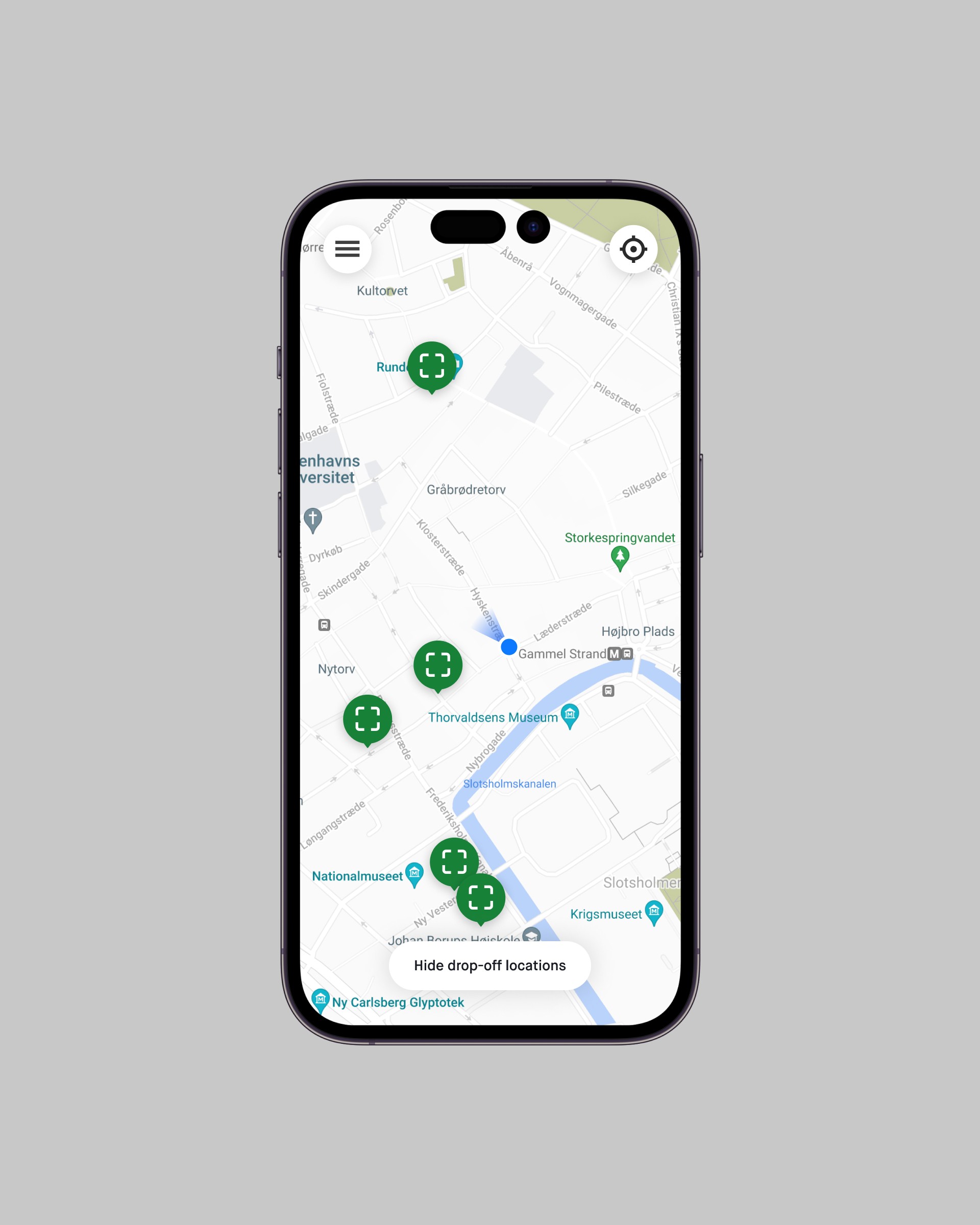
↳ Drop-off locations.
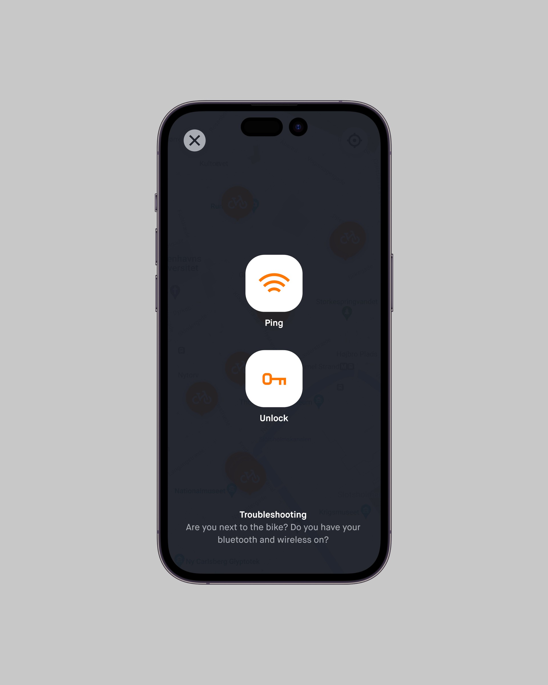
↳ Introducing the Ping button.

↳ Drop-off locations.

↳ Introducing the Ping button.

↳ Drop-off locations.

↳ Introducing the Ping button.
Adapting to challenges
To address these issues, the app design was updated to incorporate designated drop-off locations. This involved:
↳ Highlighed drop-off points
The map view was updated to clearly indicate designated drop-off locations.
↳ User guidance
In-app instructions and notifications reminded users to return bikes to designated spots. Incentives for responsible parking could also be explored.
↳ Redesigned Donkey Republic app icon.

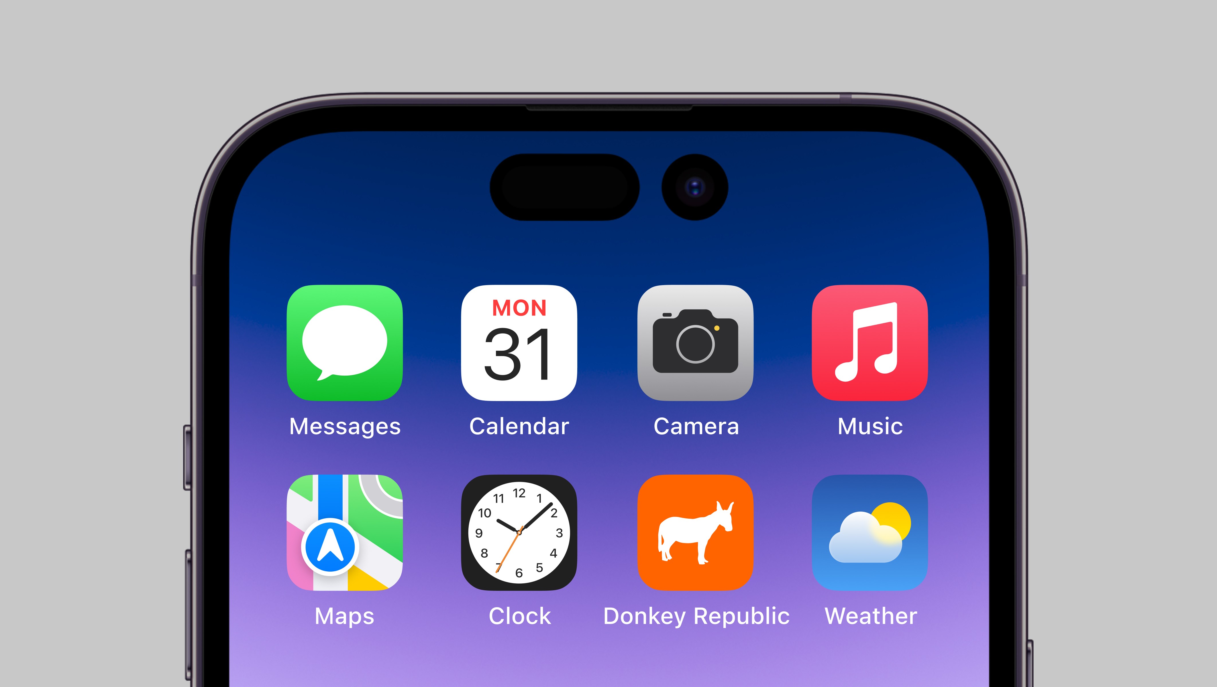
↳ Redesigned Donkey Republic app icon.

↳ Redesigned Donkey Republic app icon.
Conclusion
The Donkey Republic mobile app demonstrates a user-centered design approach that prioritizes ease of use and a seamless rental experience. By adapting to user data and business needs, the app continues to evolve to offer a convenient and reliable bike-sharing service. This case study highlights the importance of iterative design and the ability to adapt to changing circumstances to optimize the user experience.
Team
Erdem Ovacik
Jens Frandsen
Rune Kokholm
Role
Product Designer
Team
Erdem Ovacik
Jens Frandsen
Rune Kokholm
Role
Product Designer
Team
Erdem Ovacik
Jens Frandsen
Rune Kokholm
Role
Product Designer